ISO
24896 Gives Business Reporting a Common Language

When we started building TRUECHART, the problem was not that BI tools offered too few ways to visualise data. There was already a great deal of freedom in how reports could be designed, even if scaling that freedom consistently across larger reporting environments was difficult then, and often still is today. Every team could choose its own colours, layouts, chart types, labels and conventions. The result was flexibility, but not necessarily clarity.
One report showed actuals in blue, another used blue for forecast. Variances
were displayed differently from one department to the next. The same KPI could
look completely different depending on who had built the dashboard. And every
time that happened, the reader had to understand the visual logic first before
getting to the actual message.
That problem has shaped much of my work with TRUECHART over the years. It is
also why I see ISO 24896 as an important milestone for business reporting. The
principles behind it are not new. For many years, the International Business
Communication Standards (IBCS) have provided a structured approach to making
business communication clearer, more consistent and easier to understand.
What changes with ISO 24896 is the level of formalisation and recognition: this
approach is now reflected in an international ISO standard. For organisations
already working with IBCS, that confirms an established practice. For others,
it creates a recognised reference point for an area that is still handled very
differently from one company to the next.
What ISO 24896 Means for Business Reporting
The
basic idea is simple: Information with the same meaning should be presented in
the same way. If something represents an actual value, a forecast, a variance
or a particular time period, the reader should not have to work that out again
in every dashboard.
We accept this principle naturally in other areas. Technical drawings rely on
established symbols. Traffic signs work because their meaning does not change
from one street to the next. Business reporting benefits from the same logic.
ISO 24896 builds on principles that have been developed by the IBCS community
for years and brings them into the formal framework of an international
standard. That matters because visual consistency is not simply a design
preference. It affects how quickly and reliably information is understood.

The Hidden Cost of Inconsistent Reporting
This
cost is easy to underestimate because hardly anyone measures it. Nobody adds
“time spent figuring out what this chart means” to the monthly reporting
budget. But that time is real.
Multiply a few minutes of interpretation across management meetings, recurring
reporting cycles, business units and hundreds of report consumers, and the
impact becomes significant. More importantly, inconsistent presentation can
influence how information is perceived.
Colours, scales, chart types and visual emphasis all affect the message. A
development can appear more dramatic simply because of the selected scale. A
forecast can be mistaken for an actual value if both are presented in the same
way. A common notation reduces that friction.
The discussion should be about why revenue is below plan, whether a forecast is
realistic or what action should follow. It should not be about decoding the
report itself.
A Standard Only Works If It Survives Everyday Reporting
This is where theory often meets reality. Creating a style guide is relatively easy. Keeping hundreds of reports aligned with it is much harder. A deadline gets close. A new developer joins the project. Another department starts building its own dashboards. A second BI platform is introduced. Over time, even carefully defined standards begin to drift. That is why I have always believed that reporting conventions need to be embedded in the tools people actually use. You should not have to consult a manual every time you create a chart. The software should help make the right choice the natural one.

How
TRUECHART+ Brings These Principles into Practice
That
thinking is deeply embedded in TRUECHART+. IBCS principles have shaped the
product from the beginning, influencing how information is structured and
communicated rather than simply how it looks.
Across Microsoft Power BI, Qlik Cloud and Qlik Sense, the aim is not to add
another collection of visuals. It is to make business communication easier to
build, easier to understand and easier to maintain.
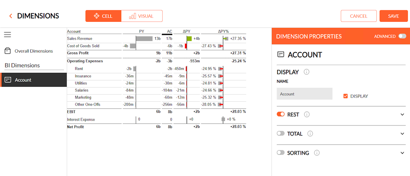
Charts are only one part of that. Tables, comments, comparisons, highlighting,
planning information and context all contribute to how clearly a message comes
across. The Table Builder, for example, makes it easier to create structured
business tables while supporting a consistent reporting logic.
The direction is simple: less time spent formatting reports, more time spent
understanding what the numbers are actually telling us.
What Existing TRUECHART Customers Should Know
For
organisations already using TRUECHART, the transition to TRUECHART+ is being
designed as a gradual one rather than a hard cutover. TRUECHART and TRUECHART+
can run side by side, allowing teams to start building in the new environment
while established reporting continues unchanged. Migration remains a central
part of our roadmap: classic Table Comments and Table 2.0 comments are targeted
for migration by the end of Q3 2026, with Perspective Comments progressing as
well, while broader support for advanced visuals, Highlighting and Compares,
Small Multiples and greater cross-platform parity is planned across Q4 2026 and
Q1 2027.
Why This Matters Beyond Reporting Design
For
me, ISO 24896 is ultimately not about making charts look better. It is about
shortening the distance between information and understanding. Organisations
have invested heavily in everything that happens before a report reaches the
decision-maker: data platforms, data quality, cloud infrastructure, automation,
planning systems and increasingly AI. Data can be collected and analysed faster
than ever before. But at the end of that chain, somebody still has to
understand what it means. If the final communication is unclear, part of the
value created upstream is lost. That is why visual business communication
deserves the same discipline we already apply to the rest of the data
landscape.
The Next Step
ISO 24896
does not mean rebuilding your reporting landscape overnight. A good starting
point is much simpler: establish a common visual language and apply it
consistently.
Want to see how TRUECHART+ can support that in practice? Book a TRUECHART+ demo
with our team.